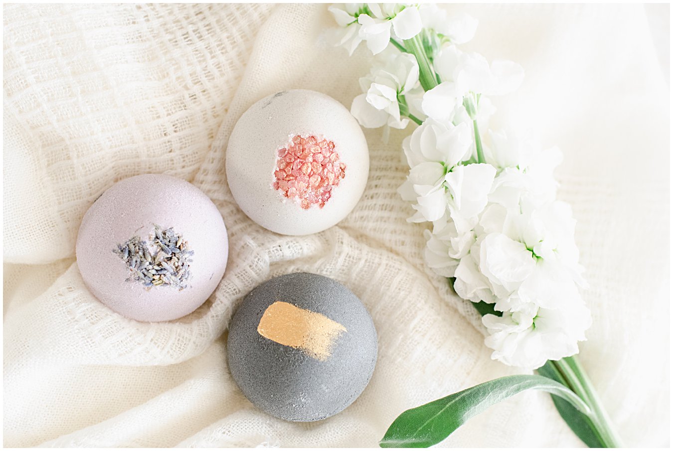
What are some considerations for images that you need when planning and putting together a shot list for your website’s images? I recently worked with Night & Daye Studio on their product photography. Sarah-Daye was in the process of rebuilding their website and needed new images of her shop’s amazing products to compliment the design for her e-commerce site. Here are a few things we planned for along the way that should be considered for your own website’s images.


What comes first?
What comes first? The website design or the photography? It depends! In the case of this project, we started off with the website’s design first. But in other cases, it’s the other way around, and the designer designs with the already created images in mind. If I know that I’m shooting first, I try to shoot scenes in both horizontal and vertical orientations, so that the designer has options when sitting down to design.

Homepage Images
A homepage’s images is like the cover of your business’s book! It gives the first impression of your business and should be polished and give the right message about your brand. Usually homepage images consist of a banner/header image and a few vertical and horizontal images of lifestyle and/or styled images of you or your products. I love creating customized stock images for my clients to scatter throughout their websites. (Bonus: these images can also be used on social media too!)

Consistent imagery for sales pages
The landing page of your e-commerce site should be clean and organized. By being visually appealing, it’ll be clear about what you actually offer. The imagery for this page should be consistent, it doesn’t have to be on white like I did for Night & Daye Studio, but the backdrop, scale, and composition of your products should all be consistent.

Product detail page images
For each of your product pages, this is where you can veer from the consistent images. The main image should be that same image on the landing page, but the subsequent images can show your product in real life or detail shots. This a great place to show your product in context of other complimentary objects to show scale and to show how your product should be used by the consumer.

Questions to ask your website designer
If we are creating images for a website that is already built, I would love a list of images for each page that you need…specifically, I need image sizes and orientation. Shooting for a banner image is completely different than shooting for a regular horizontal image, I have to leave a lot more white space to crop for the resulting image.
Bonus, many times banner images have a lot of white space on one side, the uncropped version of the image makes for great images for use in marketing materials because you can place text on the image.


Summary
Here is a list of considerations for what you need for your e-commerce website:
- Make a list of customized stock images that you need on your homepage and throughout your website
- Consistent images for each of your products with the same background, scale, and composition on your sales landing page
- Lifestyle and styled product images for use on each product page
- Take note of the image sizes and orientations that you need


